

A Fun Digital Planner to Beat My Procrastination


Type
Personal Solo Project
Main Functions:
🕒 Time-Tracking
🏷️ Tag System
✨ Fuzzy Input (Flexible logging without exact timestamps)
🤖 AI-Assisted Timeline Management
•
CONTEXT
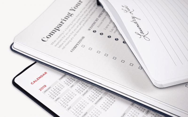
If you're a fan of the Kokuyo Jibun Planner, you might instantly recognize where I got my inspiration from. :)
I've always been a fan of planners. One of my secret hobbies used to be decorating my own planner with stickers, drawings, and different layouts. I bought all kinds of planners—blank pages, grid layouts, and structured timeline formats.
•
WHY DID I CREATE THIS?
This seemingly small question became a meditation method for me. I often find myself wondering:
🤔
Why do I feel like I’m always busy but never productive?
📖
Why do my reading lists and learning goals get pushed back… every year?
⏱️
What tiny habits are actually shaping my life?
⏳ The problem is: Time is fluid, but traditional planners are static. I needed something dynamic—a tool that could help me capture and reflect on my time without friction.
This is where AI comes in. Instead of just logging hours, I wanted a system that could:
Automatically categorize activities
Identify trends in my behavior
Help me better manage my time and mental load
If I’m going digital, I don’t want it to feel like just another app that forces me to manually type everything out.
📝 Writing on paper is enjoyable—but digital should be smarter.
So What If I Could Just Talk to My Planner?
That’s where AI-powered input comes in. Instead of manually setting times, I wanted to just say:
"I don’t feel like doing anything right now."
OR
"I’m driving home, listening to a podcast, will arrive in 20 min."
The AI will auto-categorize and structure my day without requiring manual input. It will analyze my data over time and help me spot habits and trends in my lifestyle—ultimately helping me manage stress and improve my daily routine.
•
DESIGN PROCESS
In UX and product design, this is what we called Competitive Research—but honestly, I just wanted to make sure I wasn’t about to reinvent the wheel (even if this wheel was just for myself 😉).
So, I took a deep dive into existing time-management tools to see what worked, what didn’t, and what was still missing.
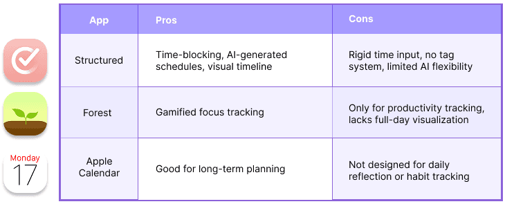
I quickly realized that nothing quite fit my needs—existing tools were either too rigid, too focused on productivity, or lacked reflection features. That’s when I knew: I had to build something different.
•
1️⃣ What Inspired Me?
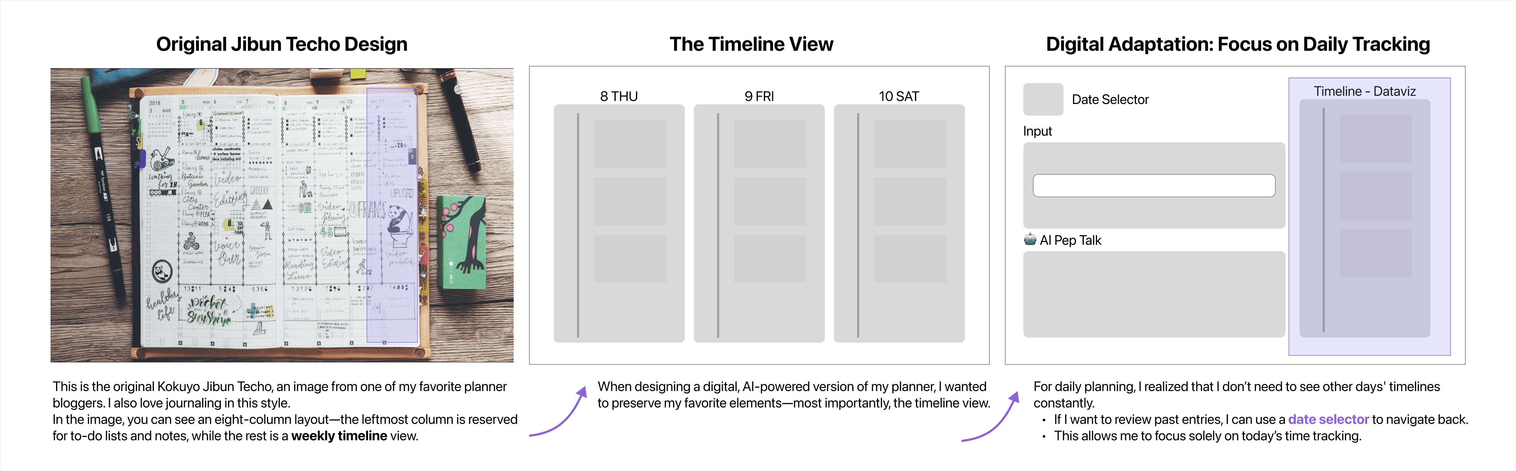
My love for Jibun Techo-style planners, especially their weekly timeline view.
The beauty of physical planners is freedom—I can sketch, highlight, and roughly mark time instead of entering exact timestamps.
Seeing a full week at a glance helps me reflect on how I spend time.
However, I wanted my digital version to focus more on daily tracking, with:
✔ A flexible, AI-powered input system
✔ Tagging system to reflect real-life activities
✔ Better visualization beyond just a timeline
•
2️⃣ Why Fuzzy Input?
🚀 The Problem:
😥
Rigid time pickers break the flow of journaling. Manually entering time and activity across multiple input boxes is tedious.
😮💨
I dislike scrolling through AM/PM selectors or tapping through multiple menus.
😔
This is how Structured's input works:
For every task, I have to manually enter the activity in an input box, pick a time using a scroll wheel, and select a color.
Now, imagine repeating these steps over and over again 10 times a day😿. Eventually, I stopped using it because I was exhausted by the micromanagement of input settings.
✨ Solution:
AI-powered fuzzy input. AI removes unnecessary manual steps, making tracking effortless. After researching existing tools, I found that Turbo 3.5 fully meets my needs—it helps extract precise activity time from my input and automatically assigns labels.
🔧 This is my MVP—a rough prototype built to validate the concept. While it may not be the most visually refined yet, it is fully functional and proves the feasibility of AI-powered time tracking. The UI wasn’t pretty. But it worked. And that was enough to move forward.
✅
Now I can simply write:
"Now I want to take a break for like 30 mins." (Even with typos!)
🤖
AI extracts:
⏳ 2:11 PM - 2:41 PM
🎧 Activity: Take a break for 30 mins
🏷 Label: Idle
•
3️⃣ Visualization: Timeline + Pie Chart
I always loved timeline views because they show the sequence of a day, but a pie chart helps visualize how much time I spend on different activities.
By implementing both timeline and pie chart, I can:
Quickly see the biggest chunks of my day (e.g., Sleep, Work, Leisure).
Complement the linear timeline with a high-level summary.

While implementing the pie chart, I also wanted to utilize my label system to group related categories together.
Before (❌ Category slices scattered)
✖️ Category slices were scattered, making related activities (like Work & Coding) appear far apart.
✖️ Slices were arranged based on size, causing unrelated categories to mix together.
After (✅ Categories grouped for clarity)
✔️ Related categories are now grouped together for a clearer, more intuitive view!
✔️ Work, Job Hunting, and Coding now appear next to each other as they should!
✔️ Chart order now follows logical category relationships instead of random slice placement!
•
Prototyping & Development

This project wasn’t just about building a tool—it was about redefining what makes time tracking truly useful.
At first, I set out with a simple goal: to create a digital version of my favorite paper planners. But as I iterated, I realized that simply replicating traditional tracking methods wasn’t enough. I needed to rethink the experience from the ground up—how people (including myself) actually engage with time, and what makes a system intuitive enough to integrate into daily life.
🔹 A → B: The early concept was purely structural—basic input, a timeline, and AI pep talk features. It worked, but I needed a to-do list and timer integration. I kept refining the design with extensibility in mind, knowing my next step was AI-driven schedule optimization—suggesting better time management based on my goals, either in the timeline or AI pep talk.
🔹 B → C: As I refined the design, I shifted my focus from "what I want" to "what makes tracking effortless and valuable?"
I built a more flexible tagging system
Simplified interactions to reduce friction
Integrated AI-powered insights that adapt to real user behaviors
By designing and implementing simultaneously, I gained deeper insights into how time tracking should actually work—not as a rigid tool, but as an adaptive system that supports real-life habits.
This journey reinforced a key UX principle:
🚀 Good design isn’t just about function—it’s about creating an experience that feels natural, intuitive, and actually worth using.
I’ll continue improving this project—stay tuned for updates!