SunWATER Plus

SunWATER Plus

I designed and integrated a mobile app and dashboard for real-time water monitoring, tailored for residents and building managers. My role encompassed UX/UI design, prototyping, and close collaboration with researchers to enhance the overall user experience.

Timeline

4 months

The Team

1 UX designer

1 researcher

3 scientists

My Role & Goal

UX designer

MVP shipped in 2024

Collaboration

Physical product team

Design team & researcher

What

SunWATER+ is an AI-powered solar panel system that treats greywater from washing and bathing for indoor reuse. It utilizes photoactive nanomaterials and microlenses to disinfect water while generating energy. The system also features a mobile app and dashboard for real-time water quality monitoring and energy savings tracking.

  • Residents and building managers in multi-residential buildings

  • Hotel maintenance teams and sustainability officers

  • Residents and building managers in multi-residential buildings

  • Hotel maintenance teams and sustainability officers

  • Domestic Residents

  • Hotels (laundromats)

Who

Created low-fidelity and high-fidelity prototypes for both the SunWATER+ panels and app dashboard.

Created low-fidelity and high-fidelity prototypes for both the SunWATER+ panels and app dashboard.

Created low-fidelity and high-fidelity prototypes for both the SunWATER+ panels and app dashboard.

How

  • Facilitated ease of use for maintenance teams, streamlining their daily workflow with actionable alerts.

  • Enabled clear, real-time monitoring of water reuse and energy savings

Enabled clear, real-time monitoring of water reuse and energy savings

Enabled clear, real-time monitoring of water reuse and energy savings

Impact

CONTEXT

SunWATER+ was developed as part of the NSF Convergence Accelerator Track K initiative, focusing on regenerative water solutions. 

SunWATER+ was developed as part of the NSF Convergence Accelerator Track K initiative, focusing on regenerative water solutions. 

Greywater reuse has historically been limited due to cost barriers, regulatory hurdles, and user concerns.

I joined the project while pursuing my master's in design at UCBerkeley. That summer, my research professor reached out, inviting me to contribute to the NSF Phase 1 design.

I worked as the UI/UX designer collaborated with an interdisciplinary team of professors, scientists, and engineers, focusing on crafting a seamless and engaging user experience that communicates the system’s operational status clearly and effectively.

PROBLEM STATEMENT

Greywater reuse faces several challenges:

Greywater reuse faces several challenges:

Challenges in existing greywater reuse technologies often deters user adoption due to unclear operational feedback, difficult maintenance procedures, and perceived reliability issues. Users require a straightforward, transparent, and engaging way to interact with greywater systems to build trust and encourage broader adoption.

💬 @MariaG (Multi-Residential Developer), April '23

Hi team, we’ve piloted greywater reuse in our properties before, but tenants often feel uneasy about using treated water—even for toilet flushing.

💬 @MariaG (Multi-Residential Developer), April '23

Hi team, we’ve piloted greywater reuse in our properties before, but tenants often feel uneasy about using treated water—even for toilet flushing.

💬 @DrChen (Water Policy Expert), May '24

State regulations around greywater reuse are constantly evolving. Any system designed for mass adoption must integrate compliance tracking so users can see if their setup aligns with local water board policies.

💬 @DrChen (Water Policy Expert), May '24

State regulations around greywater reuse are constantly evolving. Any system designed for mass adoption must integrate compliance tracking so users can see if their setup aligns with local water board policies.

💬 @LauraM (Environmental Researcher), July '24

One of the biggest issues we see in greywater adoption is the lack of real-time water quality feedback. Users hesitate to trust treated water without clear, simple indicators showing when it’s safe for reuse.

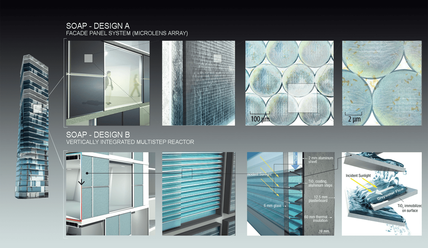
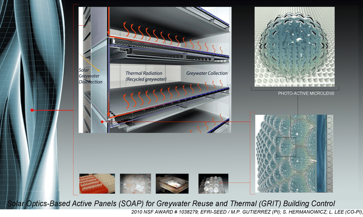
To address these challenges, the SunWATER+ science team developed Solar Optics-Based Active Panels (SOAP), integrating photo-active microlens technology to visually and thermally demonstrate the disinfection process. These panels helped bridge the perception gap by making water treatment more transparent and intuitive.

However, physical transparency alone isn’t enough—users still need a clear and accessible digital interface to interpret system status, water quality data, and maintenance requirements. That’s where UI/UX design comes in.

DESIGN PROCESS

Designing a User-Friendly UI for a Highly Complex System

Designing a User-Friendly UI for a Highly Complex System

The SunWATER+ system has inherent complexities—the physical product integrates a Greywater Panel and a Treated Greywater Tank, while the software supports its greywater treatment functionality by visualizing data from AI-driven water monitoring, filtration processes, and energy efficiency tracking.  Designing a UI for such a system presented a unique challenge:

But at that time, all we had was a mobile version and… a poorly designed dashboard 😔

But at that time, all we had was a mobile version and… a poorly designed dashboard 😔

Bridging the gap between scientific research and user-friendly design

Ensuring clarity for diverse users—hotel managers, and homeowners

Translating complex data into intuitive visuals and actionable insights

Before I Stepped in as a Designer

The initial UI concept was developed by the scientist team using Google Slides—essentially a static research paper turned into an interface. While it contained all the essential technical information, it was not designed for real users, let alone non-technical hotel managers.


📌 But this gave me a starting point. It helped me understand the fundamental engineering requirements and the needs of the physical product team. My job was to take this foundation and transform it a scalable interface that would work across different platforms.

From Research to a Mobile-Friendly UI

Over two months, I worked on:


✅ Redesigning the UI to align with guidelines for mobile usability
✅ Translating complex scientific data into intuitive, interactive visualizations
✅ Creating a scalable design system that accommodates both household and commercial users


This transformation make SunWATER+ a more accessible, easy-to-use platform for anyone looking to monitor and optimize their water usage.

ITERATIONS

Low-Fidelity Mockups for Mobile

Low-Fidelity Mockups for Mobile

I crafted low-fidelity screens to define key interactions and streamline the user experience. Given the technical complexity, I started with the research team’s initial concept. These early mockups helped translate dense data into intuitive screens, making real-time monitoring, diagnostics, and filtration insights more accessible. They served as a crucial tool for gathering feedback and iterating quickly before moving into high-fidelity designs.

Design Sample

Water Status Dashboard : Color-Coded Safety Indicators

Water Status Dashboard : Color-Coded Safety Indicators

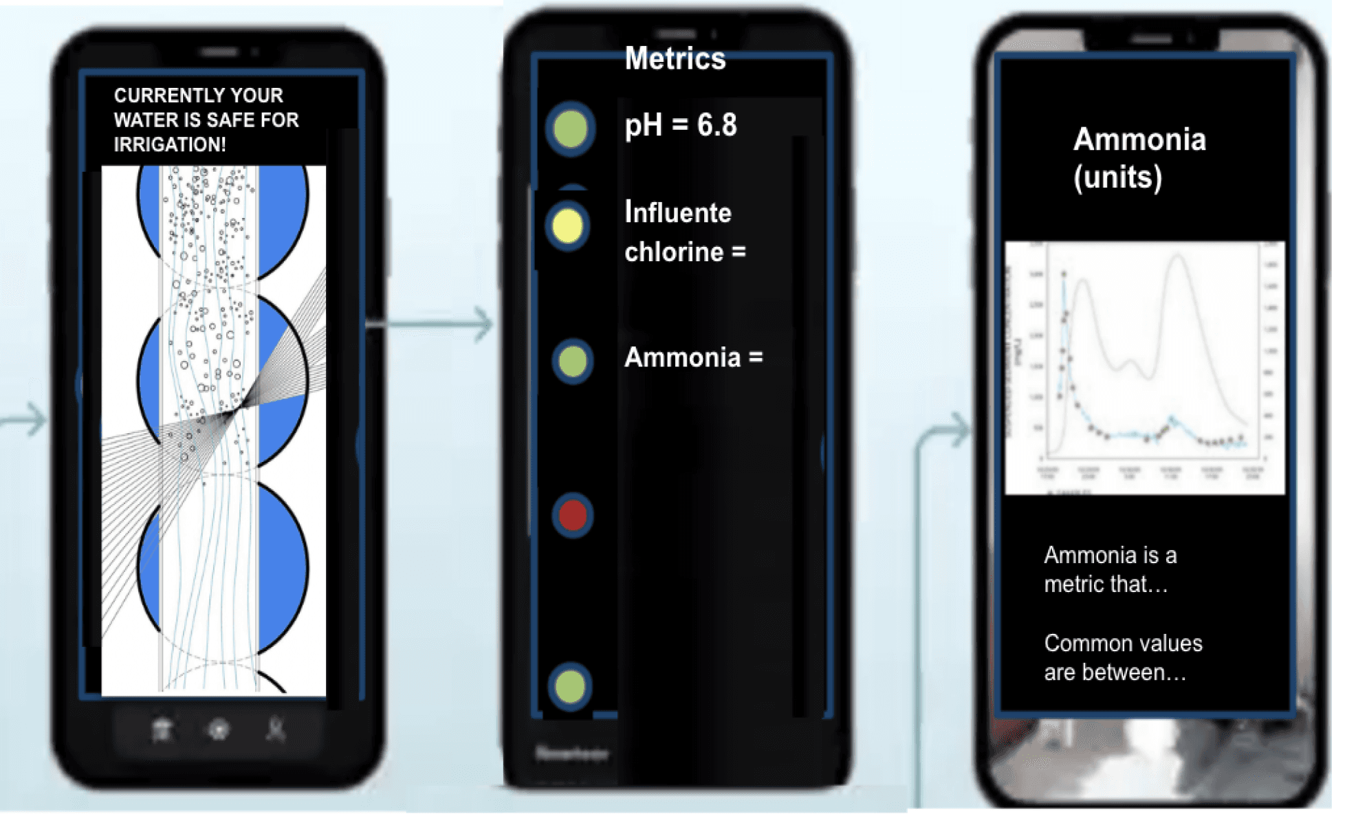
One of the key challenges was addressing users' skepticism about water safety. To tackle this, I initially explored a color-coded status indicator system, aiming to provide immediate visual feedback on water quality.

Iteration of Color-Coded Status Lights

🔵 Safe for Indoor Use

🟢 Safe for Irrigation Only

⚫ Not Safe (Two color variations: Brown & Gray)

While this approach provided instant clarity, it also raised unintended concerns. Discussions with the research team revealed that a “Not Safe” indicator created unnecessary anxiety, leading users to question the reliability of the system itself—even when it was functioning correctly.

Improved Design: Actionable Alerts Instead of Static Warnings

Recognizing these concerns, we shifted toward a more dynamic and user-friendly approach—replacing static warnings with an notification system. This decision was informed by insights from meetings with engineers, where I learned that the system stops functioning primarily due to two reasons:

  • External factors, such as power outages, causing the system to go into standby.

  • Maintenance needs, such as a filter replacement.

To accommodate these scenarios, I designed a flexible notification system that delivers clear, actionable messages based on the specific issue. Instead of simply signaling a problem, the notifications provide real-time guidance, ensuring users can take immediate action to maintain system performance.

1️⃣

External factors, such as power outages, causing the system to go into standby.

2️⃣

Maintenance needs, such as a filter replacement.

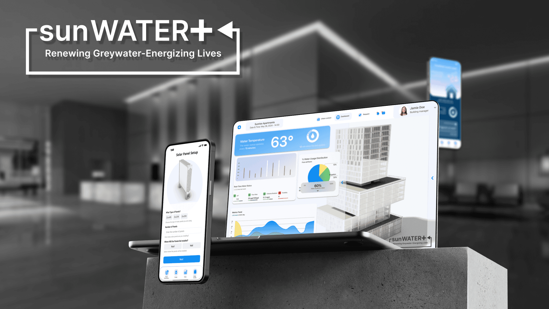
Beyond the mobile app design, I also worked on designing a web-based dashboard tailored for hotels and large-scale property management. Water quality monitoring at this scale presents additional complexities, such as identifying system anomalies and managing emergency responses.

I designed the foundational framework for the web interface, including a building installation overview with interactive elements like a slider for exploring internal system components. Given my four-month timeline, my focus was on structuring the core framework while ensuring adaptability for future refinements.

Throughout this project, I collaborated closely with architects, engineers, and scientists, conducting both primary and secondary research to ensure an informed UX iteration process. I engaged in direct discussions with the research team and project stakeholders to align technical accuracy with usability. If invited to contribute to the next phase of SunWATER+ next year, I would further refine these interfaces and expand upon system feedback mechanisms. This experience deepened my understanding of designing for trust in scientific systems, and I look forward to applying these insights to future UX challenges.